navigate_before
navigate_next

Fiat Chrysler

Audit Analysis & Redesign

Title
  • UI/UX Designer
Roles
  • UI/UX Design, Website Auditing
Industry
  • Automotive

Trust Is Built With Consistency.

I traveled to Canada to collaborate on a comprehensive content audit and redesign to align Fiat, Jeep, Dodge, Chrysler and RAM UI design systems.

Our team meticulously combed through each brand’s Global Style Guide and web pages compiling folders of screen shots for every UI component and interaction state listed below to evaluate redundancies, inconsistencies and omissions.

Input Controls
  • Buttons & Tabs
  • Drop Down Menus
  • Toggles & Switches
  • Check Boxes & Radio Buttons
Collections
  • Image Carousels
  • Accordions & Drawers
  • Colorizer Swatches
  • Galleries
Navigation
  • Navigation Systems
  • CTAs & Text Links
  • Pagination, Position Indicators
  • Search & Footers
Elements
  • Colors
  • Dividers
  • Sliders
  • Icons
Information
  • Tooltips & Disclaimers
  • Progress Bars
  • Modal Windows
  • Text Fields

After an exhaustive analysis of each brand, an organized presentation of desktop and mobile UI components were presented to shareholders which detailed the following high level takeaways from each component category:

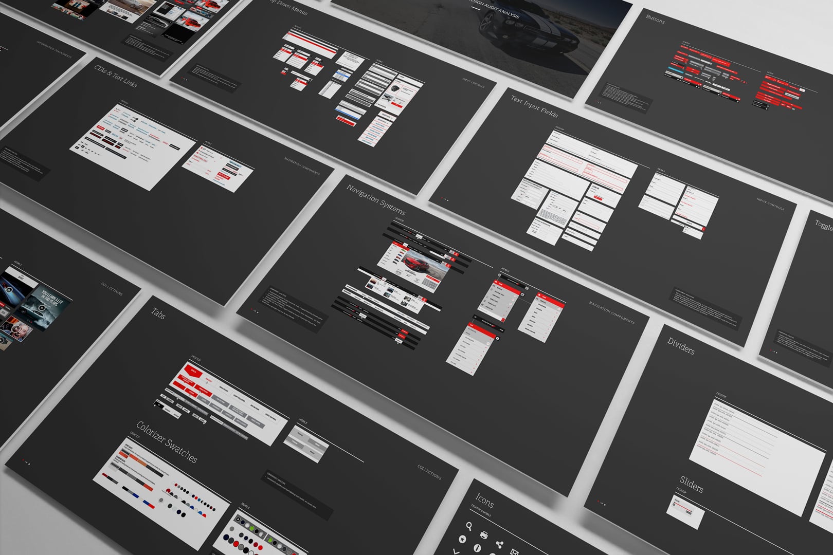
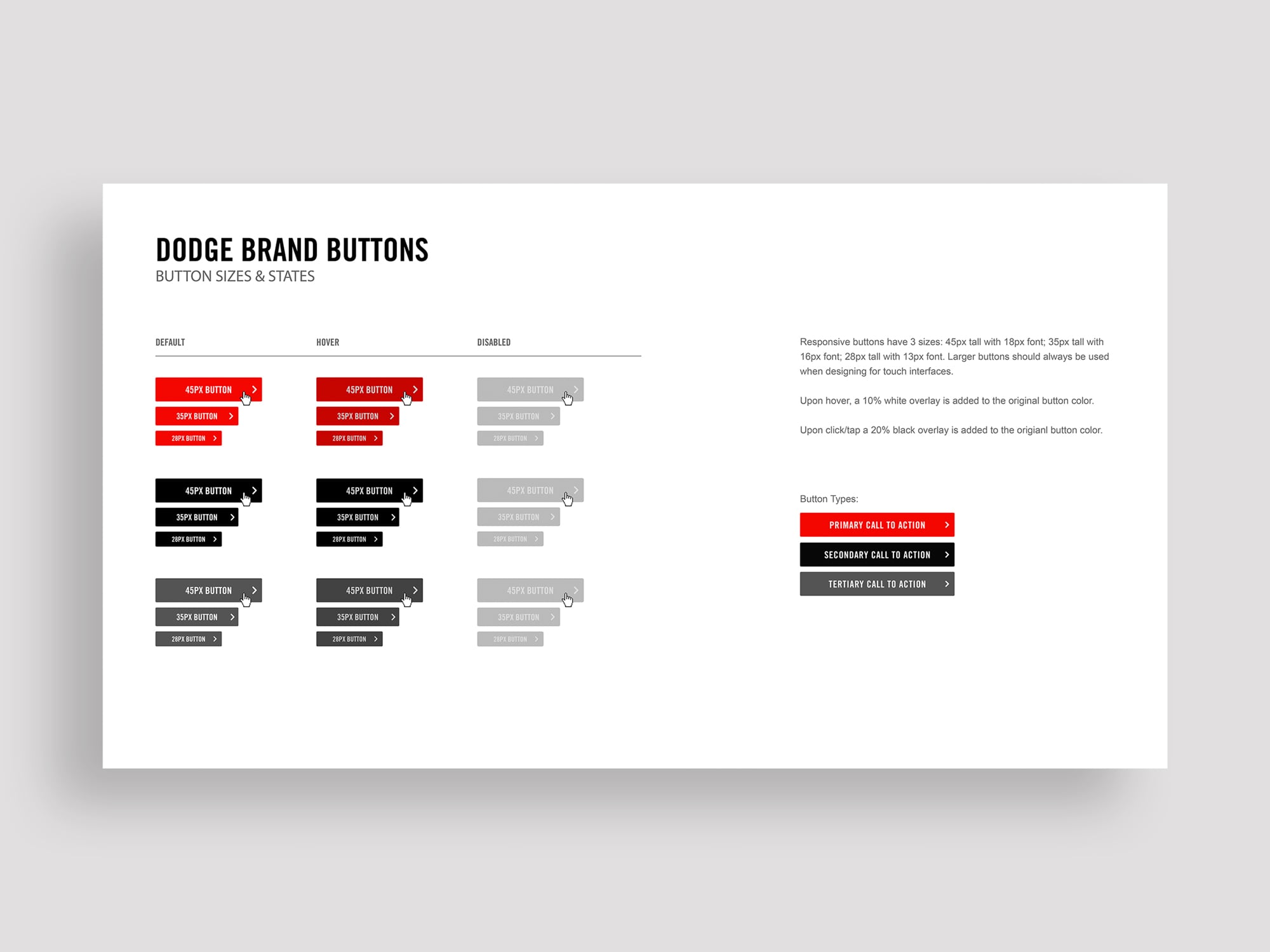
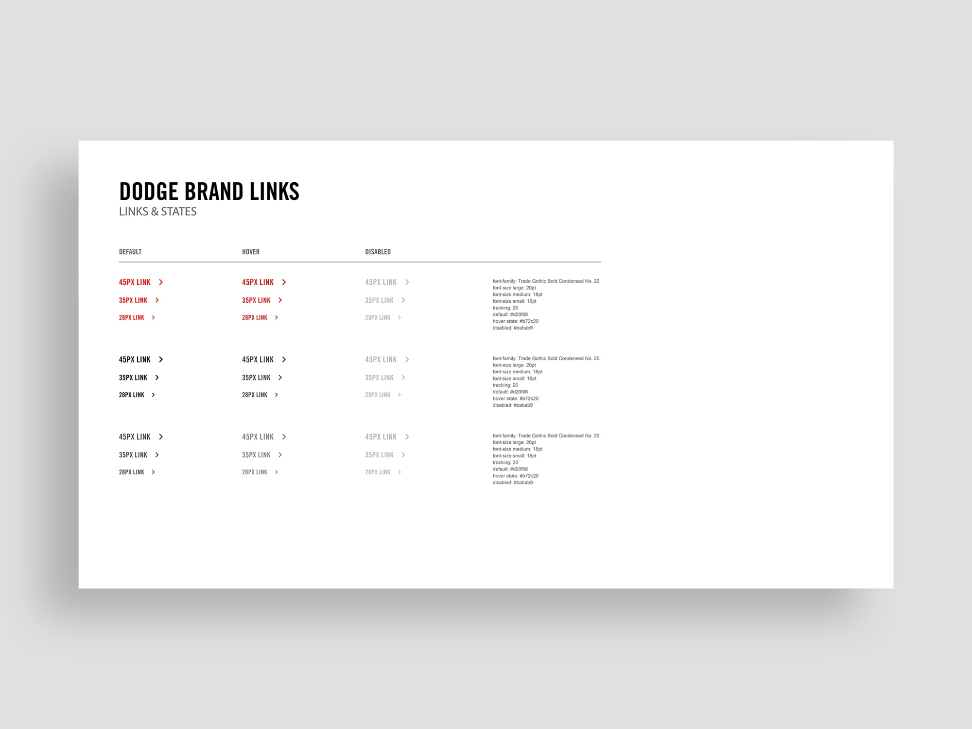
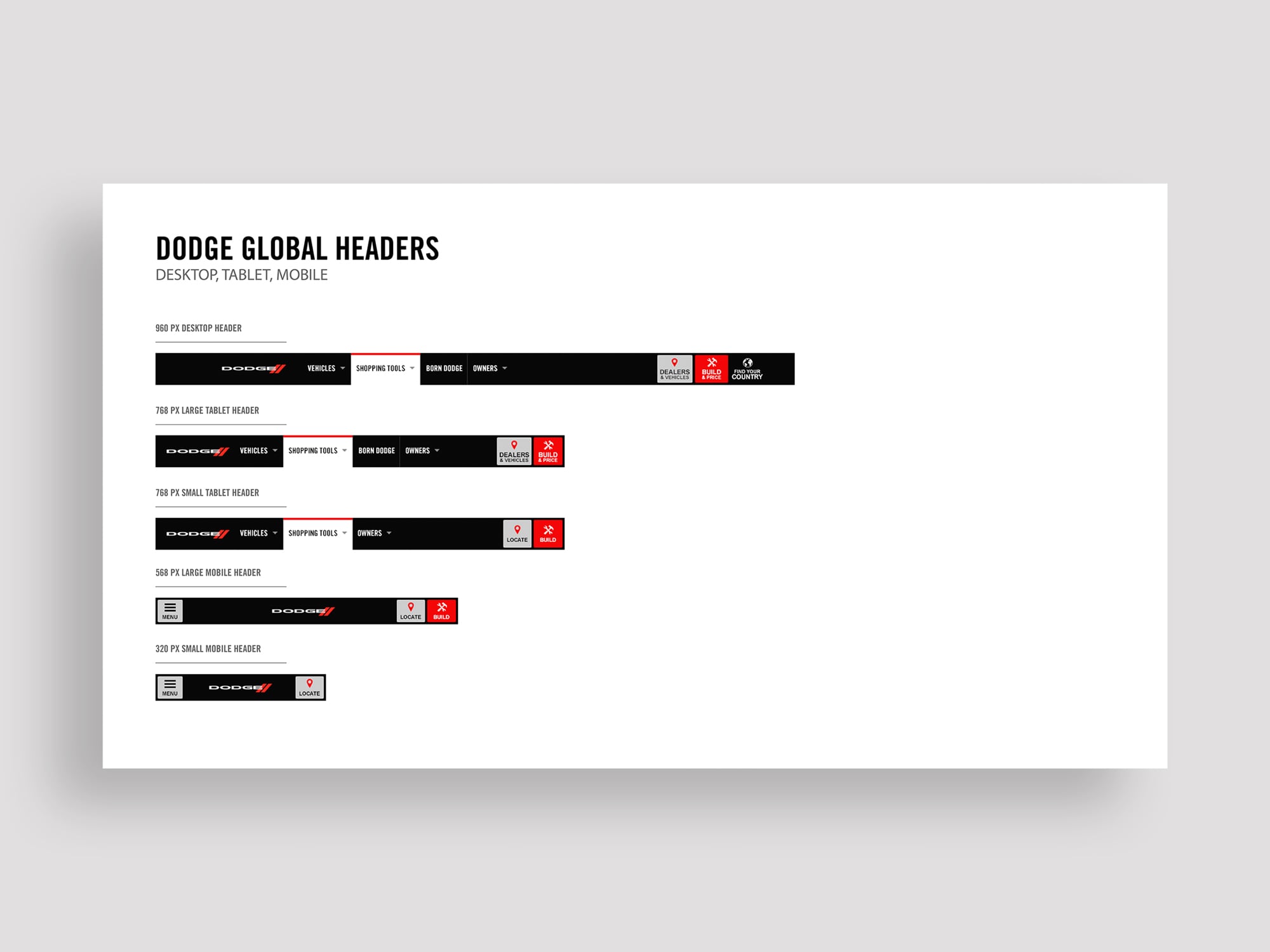
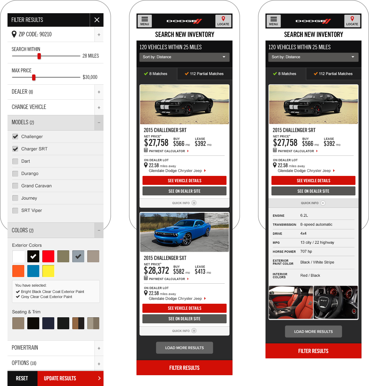
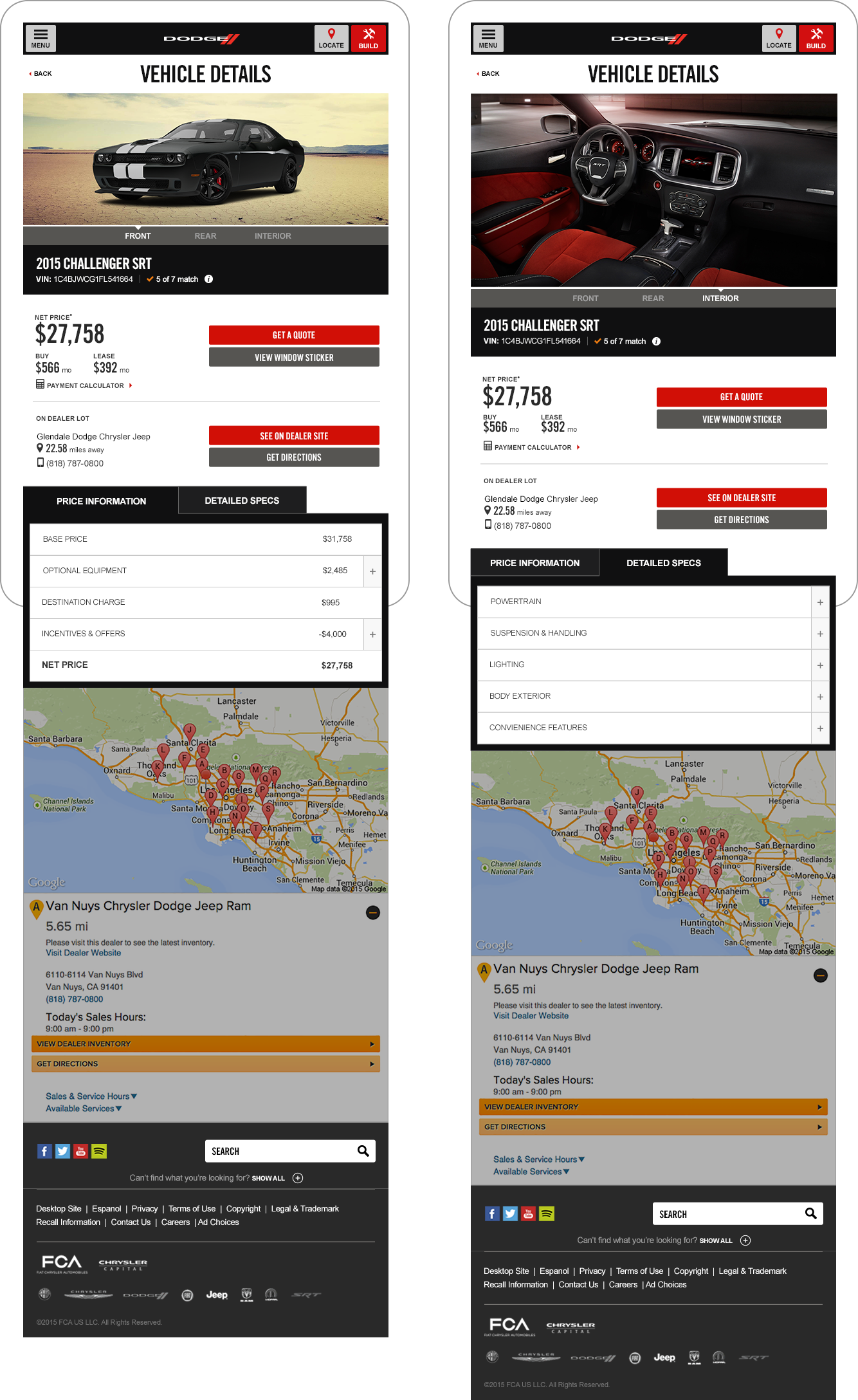
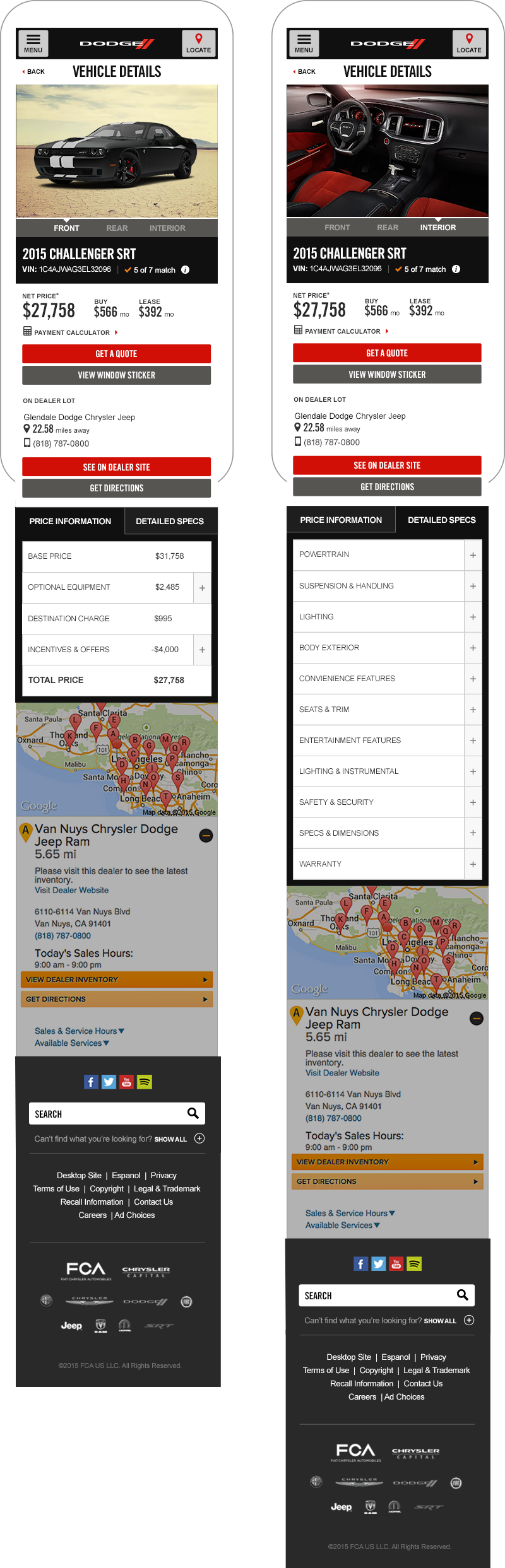
• Mobile & desktop input controls are generally consistent, with small inconsistencies in the button typography and arrow styles.

• Hover states are not always distinctive from the default state.

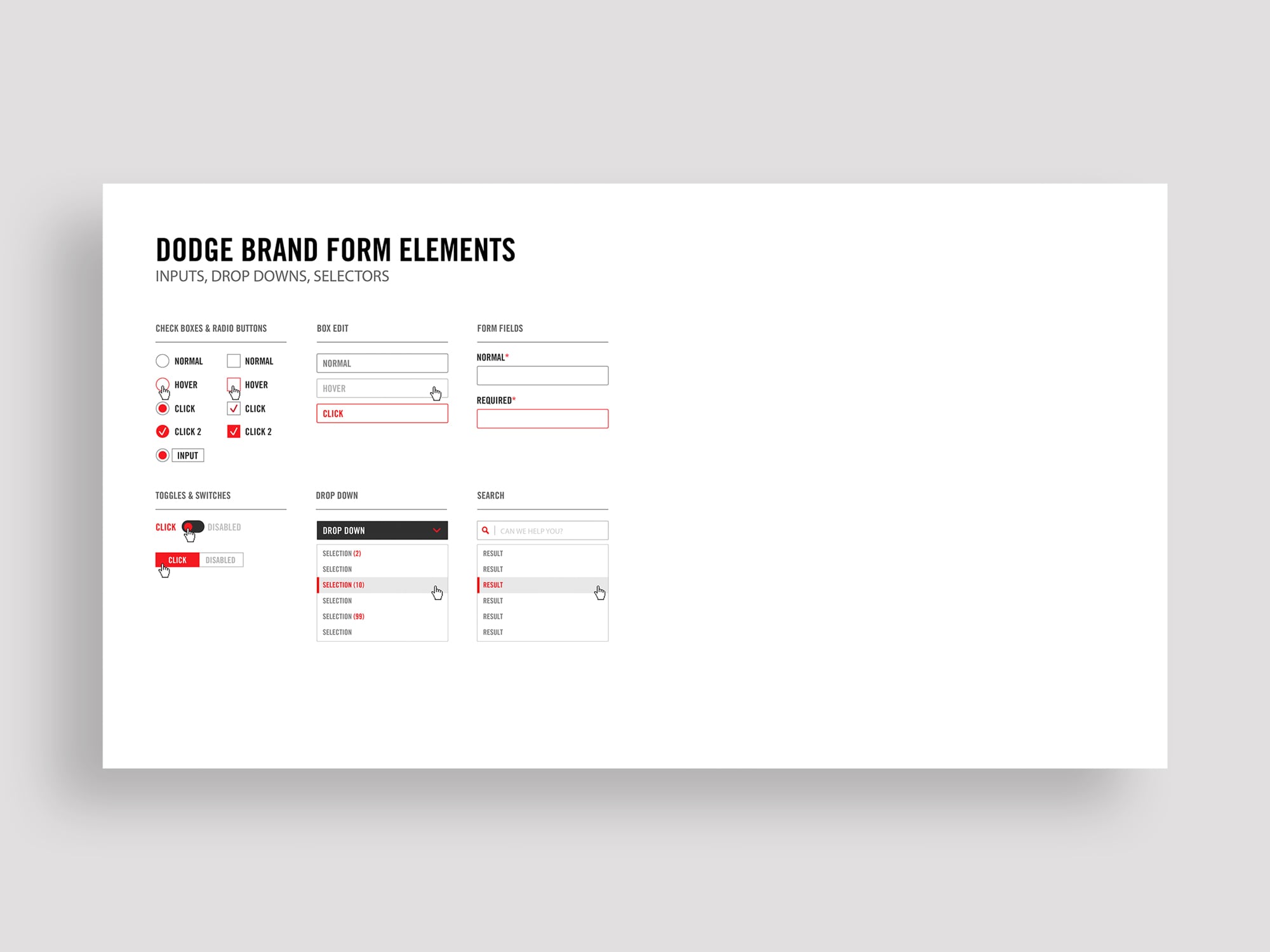
• Toggles and switches are well designed and reasonably consistent across desktop and mobile experiences.

• Text input fields, check boxes, and radio buttons could all use some minor regulation to help with consistency.

• Carousels, accordions/drawers, and video players are all very inconsistent components.

• A set of clear and consistent rules need to be defined and applied to avoid a visual fractured experience.

• Navigation is generally consistent.

• Navigation of Tier 2 mobile and Tier 1 mobile site have slightly different styling.

• CTAs and text links need improvement as they are currently very fragmented in styling.

• Many of the mobile links do not pass accessibility tests due to poor color contrast.

• Iconography is generally good, though duplicitous icons has lead to an inconsistent experience within certain components.

• Tooltips, disclaimers and progress bars are generally consistent.

• Modal windows need much more consistency around styling of ‘close’ button.

The Iteration Process.

Once we identified user needs, a new UI design system was developed for shareholder review. For the sake of visual redundancy, this case study
will focus on the Dodge Brand .

From Concept To Completion.

After finalized shareholder reviews, the new responsive interfaces and component libraries were applied to each Fiat Chrysler brand website.

Search New Inventory Pages

960 PX FILTER

768 PX FILTER

568 PX FILTER RESULTS

568 PX FILTER VEHICLE TILES

320 PX FILTER RESULTS

320 PX FILTER RESULTS

320 PX VEHICLE TILES

SHOWING QUICK INFO

Vehicle Detail Pages

960 PX FRONT IMAGE

SHOWING PRICE INFO TAB

768 PX INTERIOR IMAGE

SHOWING DETAILED SPECS TAB

568 PX FRONT IMAGE

SHOWING PRICE INFO TAB

568 PX INTERIOR IMAGE

SHOWING DETAILED SPECS TAB

320 PX FRONT IMAGE

SHOWING PRICE INFO TAB

320 PX INTERIOR IMAGE

SHOWING DETAILED SPECS TAB